Packaging
Albany - Nestlé, South Africa
A full redesign of the Albany chocolate bar range, repositioning the brand with a richer, more contemporary look and feel. The new creative direction focused on bold colour blocking, flowing flavour cues and indulgent chocolate imagery to elevate shelf impact and better express Albany’s smooth texture and bittersweet taste. A deeper palette and refined typography introduced stronger quality cues, transforming the range into a more premium everyday indulgence. (Design, Creative Direction)


Various Confectionery
Packaging design and creative direction across multiple Nestlé confectionery brands in South Africa. This included a pack refresh for Smarties, creative concept development for Bar One, and new product packaging plus in-store POS for the limited-edition KitKat Slo’ Cool and Aero Slo’ Cool range. Each project focused on shelf impact, modernising familiar brands and creating stronger appetite appeal through bold, contemporary design. (Design, Creative Direction)


Purina PetCare – Vitagen, South Africa
A full packaging refresh for Vitagen dry dog food, evolving the range with a brighter, more confident shelf presence while strengthening cues of health, vitality and nutrition. The redesign focused on clearer navigation by life stage, bold use of Vitagen green, and friendly, benefit-led pack architecture — creating a more modern, cohesive range designed to stand out in a highly competitive mainstream category. (Design, Art Direction, Creative Direction)

Purina PetCare – Alpo, South Africa
A 12-SKU portfolio refresh to modernise and unify Alpo while protecting its heritage positioning. The redesign strengthened shelf impact, improved range navigation and introduced new art-directed product photography to elevate quality and appetite appeal across the brand. (Design, Creative Direction, Art Direction)

Purina PetCare – Husky, South Africa
Established in 1971, Husky has long been a recognised name in South African dog food. At the time of this project, the brand sat within the Purina portfolio, positioned as a trusted, accessible choice for everyday feeding.
The design introduces a playful, energetic visual language built through bold colour, expressive typography and illustrative styling. The front of pack balances strong brand presence with appetite-led food photography, while the back continues the same tone through hand-drawn graphic elements and clearly structured information. Together, front and back form a cohesive system that combines clarity and consistency with warmth and energy.
Across the range, a bold black background creates consistency and a more premium feel, while vibrant flavour colour coding supports clear differentiation and easy navigation at shelf. The playful design language is applied consistently across all variants, ensuring the range feels cohesive while allowing individual flavours to stand out. The result is a confident, eye-catching launch that feels recognisable, engaging and easy to shop within a competitive pet food category. (Design, Illustration, Creative Direction, Art Direction)


Dunelm - Eden Bay
Dunelm required gift packaging for a range of premium ‘make your own’ products that needed to appear luxurious and beautiful in appearance, aimed primarily at the female market.
I was originally inspired by vintage black and white Japanese floral patterns. Using a hand drawn illustration suggests a handcrafted product, a classic look that’s in touch with nature. A two colour approach gave this design a gentle sophistication with good shelf standout and felt very on-trend. Products in this range included spa treatments, a make your own soap kit and flavoured candle set. (Design, Creative Direction)


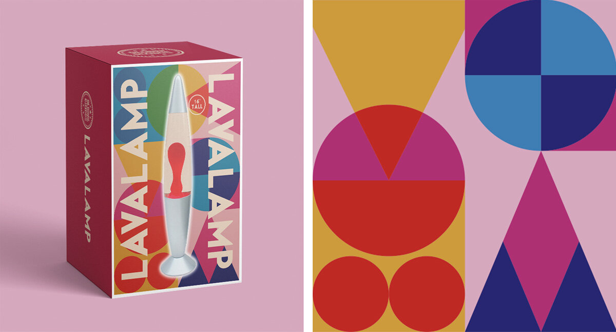
Dunelm – Various
Spa Bar Body & Bath and Lava Lamp gift packaging. (Design, Creative Direction)

Pams
Concept - Packaging for a range of rice products in a gunny bag. (Design, Creative Direction)


Simply Living – Storage Containers
Concept - A new design for Simply Living Food saver range. (Design, Creative Direction)

Bombardier Beer – branding & packaging design
Rebranding Bombardier, a classic national cask ale beer brand. The brief was to create great in-store shelf standout and the iconic St. George’s flag branding led to a notable increase in sales. (Design, Illustration, Creative Direction)


Luolai Homeware
Luolai Homeware is a new Chinese concept store that represents the upmost in quality in internationally and globally inspired Homeware products with a dedication to detail that is second to none. Luolai Homeware stores are spaces for inspiration and guides to living well. Encompassing furniture, homeware, lifestyle accessories, books, gifts, as well as domestic textiles making it a true ‘lifestyle’ store rather than a traditional interiors or home store. (Design, Creative Direction)

Thorntons Chocolate
Continental ‘Taste Journey’ pack concepts. (Design, Creative Direction)
